To start this second part of the Velazquez Prize, a myth must be dispelled. Reference to Velazquez should not come as part of an examination of Impressionism. Artists, today, wrongly think they are Impressionists simply because they use a painterly or rough approach to brushstrokes on a canvas. The use of broad brushstrokes does not an Impressionist make. The Impressionists used a brilliant palette that included pure color with shadows and highlights composed of color rather than neutrals. They shunned the thick varnishes and glazes of the academics that warmed and muted color. Because one uses loose, casual brushstrokes and an alla prima technique does not mean one is an Impressionist.
Secondly, the Velazquez Prize covers only the portraits, not works such as the Surrender of Breda and Las Meninas. His techniques changed a bit from work to work and certainly changed from large scale works to more intimate themes like his portraits. It is true, however, that Velazquez painted with a degree of quickness in most of his works without relying on techniques of many other artists of the day, such as those in Italy.
The ground, the basis for his portraits, grabs the most important part of the process. Using a rough canvas, Velazquez put down a “dry” tint of a pinkish, red sienna that he relied on to form an important basis for the color of his composition. He then drew in the contours of the figure in black or a dark color to establish the occupation of the form in space. This is really no different than the way he sketched for a study:

Enter a caption
Study for the Head of Apollo
In a sense, if he continued working Study for the Head of Apollo by applying color, he could have come to a “finished” picture. Ironically, this would also be the basis for a monochrome rendering that, once dry, would provide the foundation for glazes of color in a painting during the Renaissance. In fact, Velazquez was well aware of the Italian artists of the Renaissance, as well as those during his time. It is said that he was heavily influenced by Titian and Rubens, for instance.
Nevertheless, Velazquez did not wait for the ground to dry, but began working the canvas wet on wet. He used oily layers of paint (less pigment) to work up the materials such as drapery and flesh, while his accents were more opaque and thick. Often, the ground was left to show through such as in shadows under the orbital crest, just above the eyes:

Portrait of a Man (detail), ca. 1630
Notice in Portrait of a Man not only the amount of ground that shows through, but also the thinness of the paint that causes the definition between surfaces to become diffuse and blurred. Where there is emphasis, such as in the highlights, the paint becomes thicker. The details such as the eyebrows and mustache are quickly rendered with deft hatches of unmixed color.
This casual approach resembles a sketch. Yet to get a refined image, besides a tremendous facility with a brush, a careful application becomes essential. The balance of wet, thin layers and thicker, opaque highlights and definition requires great skill and agility. If this sounds familiar, we can find a similar balance in the works of Rembrandt, for instance.
Let’s look at a series of details of his picture of a seamstress:

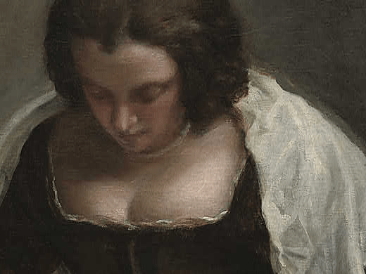
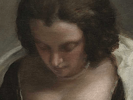

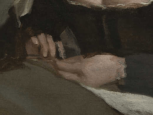

This picture is considered unfinished. I am not too sure about that, but notice the amount of the tinted ground that shows through. One easily recognizes the harmonizing effect of this method.
Fortunately, since the end result of my investigation of the painting techniques of Velazquez is to complete a painting in either his manner, paint a pastiche, or re-imagine a Velazquez work, I have, in completing figure studies, worked in the exact same methodology:
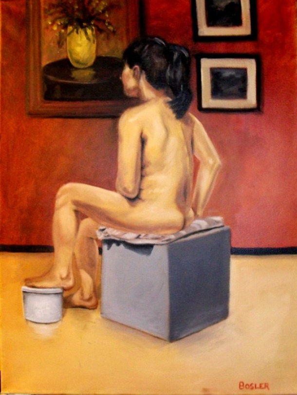
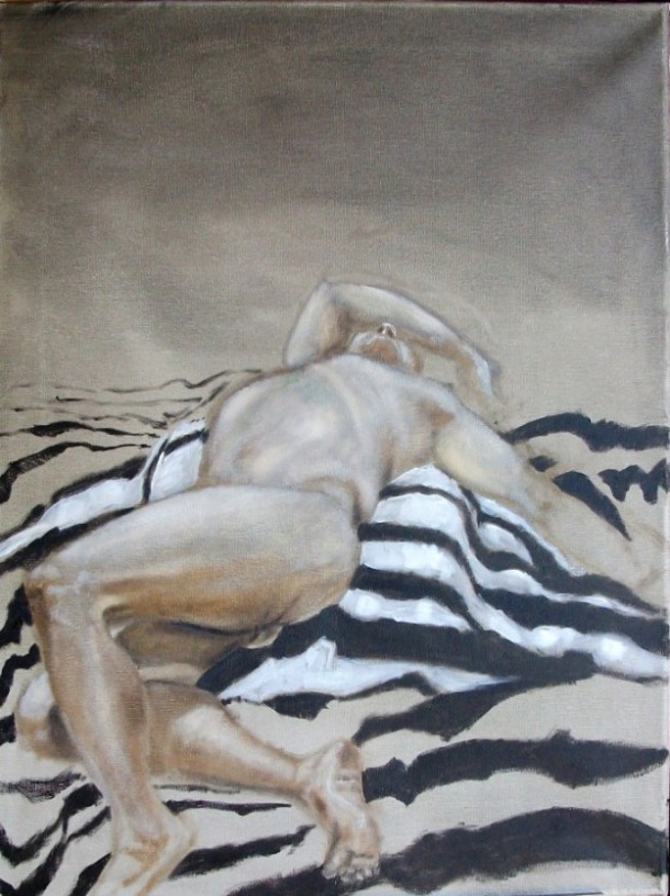
Woman in the Studio, Oil on Canvas, Howard Bosler 2010
I worked this canvas starting with a reddish tinted ground that readily shows through in many places. First I mixed a little linseed oil with turpentine and ochre and red sienna. With a Japanese brush, I generously applied this mixture to the canvas. Once the canvas was coated, I removed some with a rag until the degree of “wetness” was where I wanted. I then sketched the figure with some Van Dyke brown which became blurred as I worked the form. Some of this sketch can still be seen around the box that the woman is sitting on. Paint laden with linseed oil was used to begin modeling. Eventually, for highlights and shadows, I used thicker paint, sometimes straight from the tube or without thinning. The background was rendered with broad brushstrokes. The two photographs, for instance, were made with strokes of white and black forming the matte and the frame, respectively. The ground is easily seen in and around the pictures.
Another work of mine that was worked in the same way as the Study for the Head of Apollo:
Twisting Nude, Oil on Canvas, Howard Bosler 2010
This picture was done using broad brushstrokes on a wet, tinted ground, using few colors, sketched beforehand with a few lines of Van Dyke brown. Many details are left to the viewer’s imagination.
One of the remarkable features of a Velazquez portrait is the economy of strokes. He does not seem to hunt for the form. His strokes are only for what is necessary. In other words, his canvases are not over-worked. Amazingly, when radiation is used to reveal drawings or underpainting, many times, nothing is revealed, as if he simply stepped up to the canvas and began painting. He does not, at times, labor over superfluous detail. We see this in his painting of Mars:

Mars, Oil on Canvas, Prado 1640
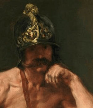
Mars (Detail), Oil on Canvas, Prado 1640
Besides a considerable amount of ground used for the formulation of the shadows in the detail of Mars, one can see how quickly and cursorily the hand, face and helmet are rendered. The hand, in fact, borders on the abstract. Even so, as with most Velazquez pictures, when one stands back, the picture’s details are filled in with the mind.
As for portraiture, I don’t find Velazquez particularly revolutionary in terms of composition. Just as I am less inclined to accept the hyperbole of those that pass out superlatives claiming that Velazquez is the greatest artist. Art criticism is subjective and not empirical. Throughout history many individuals made impressive leaps of creative genius. Perhaps I could say that Imhotep, the architect, high priest of Ra, and chancellor of Djoser, is the greatest of all time. What about Apollodorus of Damascus who designed the beautiful Pantheon? Obviously the list of great artists could get quite lengthy.
Really, the only thing left to mention regarding Velazquez’s technique is his limited palette. Taking a cue from the Venetians, he kept his palette to those typical pigments of the time. Some example palettes:
Rembrandt:
Yellow ochre, umber, lead tin yellow, azurite, smalt, carmine lake, malachite, bone black, lead white, vermilion, ultramarine, naples yellow.
Caravaggio:
Umber, yellow ochre, red ochre, vermillion, lead white, carbon black, lead tin yellow, copper resinate.
Velazquez would have used a similar palette as the two above. None of the bright colors that came about during the nineteenth century were available or would have been necessarily desirable during his time.
A lot of ground was covered in this section. Hopefully, at least in general, we have a good idea of the methodology of Velazquez in painting portraits. It is said that his portraits took only 6 to 8 hours by the techniques he utilized. Certainly, he did not deal in extensive preparation and painted alla prima. Although we have some preparatory drawings by Velazquez, these are mainly for larger works. He didn’t seem to need such preliminaries when it came to portraiture.
So, now that we have the technique, palette, and sense of composition, the next decision is the nature of the composition to paint: a copy of a painting, a copy with changes, a picture in the manner and technique of Velazquez. Once this decision is made, the next step will put paint to canvas. Doing a pencil or charcoal drawing is out of the question. Going directly to the canvas speaks to the Velazquez methods.
Note: For a scholarly look at the painting techniques of Velazquez, click on this link.
HBosler
https://howardbosler.wordpress.com

Self-Portrait in Red

Pingback: The Velazquez Prize: Nearly Ready – Howard Bosler Artist
Pingback: The Velazquez Prize: Finishing | Howard Bosler Artist